Change isn't always progress
by Volker Weber

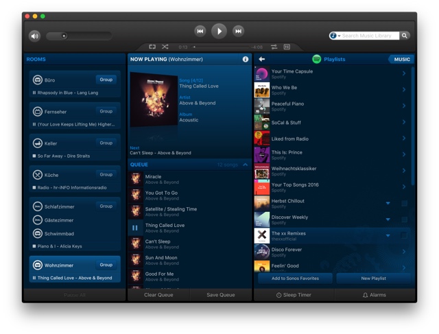
The Sonos UX on macOS hasn't been updated in years and it is so much easier to use than on iOS.
Comments
I fully concur. The UI on the desktop looks a bit dated and dark, but it is super-fast and easy to use.
The iOS Apps used to be similar, but the new UI there still manages to confuse me. Still hoping that users will be heard and that they revert back to the old more easy navigation. Did they skip user testing or do we just not get it?
Exactly.
The latest iOS Sonos app ist just a mess. I.E. changing rooms does not work as it should - sometimes it does, sometimes not. Previous app was ok, so (my local) WLAN is not the problem. Sonos MUST get better.
Echo that. iOS app drove me crazy with rooms and groups and navigation taking a very long time to understand. And even then... I keep doing it wrong. It’s just not intuitive. If end users keep doing it wrong, UX is off.
I would agree completely. I use about 30/70 macOS/iOS for controlling Sonos. Much easier and way less frustrating.
The only detrimental change I've seen is that removed the "A-Z" shortcuts (RH side) a few versions back when browsing a music library. That's still present in the iOS version.
Well, I’d say the app improved. The main buttons on the bottom make reach easier for big screens. The true issue for me is that when you choose a room and then look for music for it, you lose the context, that is pretty weird. Also searching over all sources is useless as I cannot control what is searched and in which priority.
There are a lot of people that say the exact opposite about that desktop app. Include me to them. It looks pretty dated and has a lot of design patterns that seem not to match to todays use cases.
Having used Sonos for about three years now, I don't see any major problems with the new design on iOS
The one thing I am constantly missing is that I can predefine some often used combinations to quickly regroup some rooms.
In this case change is indeed not progress, and this ever since they switched to the "modern" iOS design. Already back then Sonos did not take feedback very well and apparently can't get it right to meet expectations of their "old" customers ...
@Christian: Did you have a look at Macronos (Android) or SonoSequencr (iOS)? They should support your use case (at the cost of € and an additional app).
[Disclaimer: I do not use any of these]
Jonas
Precisely. The same is true for the Windows version. Oldie but goldie.
Remember the first incarnation of the „new“ V5.0 iOS app back in 2014? It was a complete and utter mess, but gradually improved over time until it became fairly usable in 2016. I sometimes missed the familiar 4.3 version, though. The post „Don't Like the New App v5.0“ still is the entry with most comments in the SONOS community forums.
Now SONOS broke the app again. Not as hard as 3 years ago, but the logic behind the redesign escapes me. DON'T MAKE ME THINK. Nor guess, for that matter.
Pretty please!
Funny enough I am missing the third party controller 'Zonos' from the windows phone / mobile times 😆
That is running on Windows 10 just fine.
Yeah, but not on my Android devices.
Thumbs up! That new iOS controller is a usability disaster.

