Today I updated my Notes Mac client to version 10 - rather the version 10.0.1
The experience is basically the same, like in version 9 at the first impression. But I can customize the colors of many parts.
Going to the Preferences, (Fonts Colors and Themes) and today I have a more or less modern looking software for my daily business.
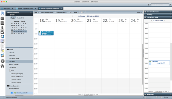
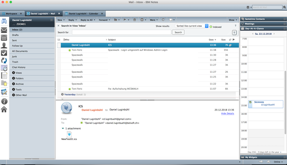
Mail, Calendar, Contacts and ToDos
The new color scheme is changing the navigation and the buttons of this database. But some colors and icons (currently blue) are into the template. For this part it’s very tricky...
Choosing a color scheme that is matching the colors from the template.
Outside of the mail template I would like to customize Icons and colors as much as I can, to get a clean look.
The "Open-List" on the left side:
That point is a pain for me. I’d like to hide or change every icon.
I wish that all the settings of the "Open-List" and the Icons should be customizable and push able by policy.
So I changed at least the (wrong) Icon of the ToTo’s and I removed as much as possible.
Icons of: Composite Applications, History and Discover are not removable.
Short-Cut buttons on the top:
I removed all buttons, because they are somewhere else anyway. Only the search field on the top-right side is not hideable or customizable.
Sidebar Panel (right side):
At least this part is looking good since version 9.
Bug: If I choose a color scheme the “bar title” doesn't change the color, it’s still grey.
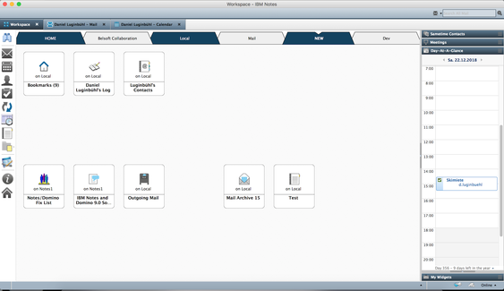
Workspace Background:
I prefer "none". (It isn’t actually none, they are some diagonal lines in grey and a white background.) The database links are looking good and clean with a one-pixel frame.
By the way, the default background of Notes 10 - after the installatione is looking like 2003 - awful.
You can add some fancy background images to your workspace in Notes 10. (A well communicated feature) On the first impression it looks awesome. But from my point of view I'd like to work with a minimalized, clean visual experience of my computer programs.


Conclusion:
With some effort I can now modify my client to have a better visual experience.
From the prospective as a graphic designer it’s just a mess.
At least the “Open List” isn’t that difficult to improve.
Here is an offical idea in detail: